
One Room Challenge Spring 2020 – Week 2 – Moulding Musings and Painting it Green
If you have clicked over from the One Room Challenge Website, welcome! I’m glad you are here! I am an interior designer and serial DIY’er based in Red Deer, Alberta, Canada! You can catch up on my One Room Challenge project in the last week’s post HERE where I talked about the plan for my dark basement guest room. Be sure to follow along on Instagram for more behind the scenes, and subscribe to the blog at the bottom of this post so you don’t miss the weekly updates!
This post may contain affiliate links. That means if you purchase anything from these links I earn a small commission, at no extra cost to you! This helps support my blog, so thank you!
Trim and Mouldings
I love a traditional space and I also love how the addition of moulding helps any room feel more polished and designerly, and a lot more high end. But moulding is actually not all that expensive, and depending on the type can be fairly easy to add to any room.
When I consider what to add to a space, be my own or someone else’s, I like to consider the style of the rest of the home so the home feels cohesive. I do not feel like craftsman style board and batten belong in the same house as an intricate and detailed box moulding. If your house does not have a style and is fairly builder basic, I think you can go ahead and define a style but once you have decided what you are doing, you should really try and stick with it.
My home is a craftsman style. I chose this style when building basically because craftsman homes are works of art, in my opinion. They have mouldings galore and back in the day they were built by, you guessed it, craftsman. What is not to love about that?
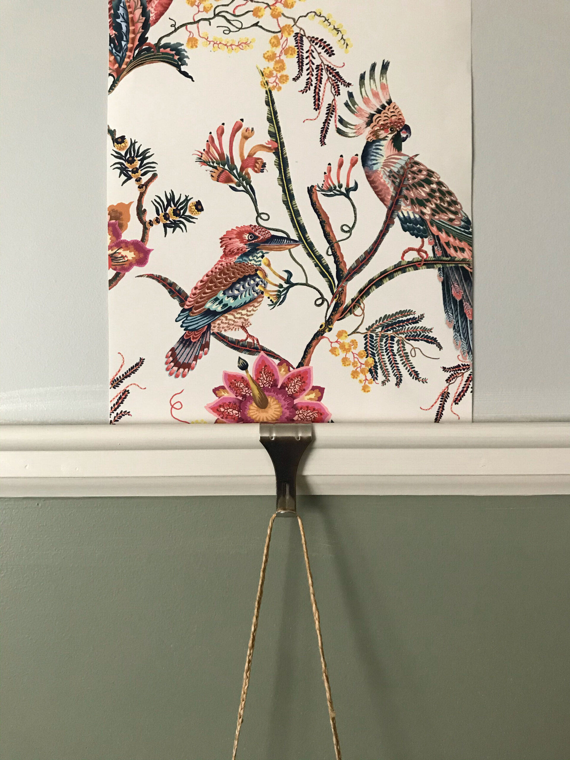
What does all of this have to do with the One Room Challenge you ask? Well, my finish carpenter added a lot of mouldings to my house at the build stage but that dude was expensive, so some rooms just didn’t get a lot of detail, like my guest room. It was a square box with just the same baseboard and door/ window trims that were elsewhere in my house. So when the time came to think about the design in here, one of the first things I thought about was how can I add character? And the answer came to me pretty fast, and that’s moulding. I also knew I wanted to add wallpaper (I’ll get into that a bit more in a future blog post) so I brainstormed about how I could add both? Then, I remembered a special kind of trim that I had seen on occasion, mainly in English style homes, and went down the rabbit hole of Picture Rail Trim.
Picture rail trim is a type of trim hung near the top of the wall that was used in the days of plaster walls, so that pictures could be hung and moved around easily without putting holes in the plaster, which is hard to repair. Hooks that are made for the trim are hung off the moulding and pictures are then hung from a chain or wire. Picture rail trim is not very common today, but I was pleased and delighted to find out during my research that is is actually a fairly common detail in original craftsman homes, so if I used it, it would be staying within the architectural style I had defined for my home. CHECK.
I also LOVED how paintings and art looked hanging from a picture rail. LOVED IT. So heart was set on adding it. Easy right? Not so much.
No one carries this stuff in Canada. Lowes, Home Depot, Rona, all my local lumber yards looked at me with blank stares when I asked them to help me find some. This was going to be harder than I thought.
I found what I was looking for online, and then discovered that my local lumber yard actually was a supplier of this particular brand. Keep in mind I had already been to this same local lumber yard asking for this stuff and they informed me I could not get it!. So I went down there again with a photo and SKU number in hand. Once I had that, they said that in fact they could order me some. Yay! Then they actually called the supplier, who told them no, they actually won’t ship that particular style of trim to Canada. Boo. But then the helpful lady saw my sad face and quivering lower lip when she told me my picture rail dreams had been crushed and she decided to try a little harder. She phoned another supplier’s head office and talked to several people about what this trim looked like and it turns out they made it, and could in fact ship it. Cue birds singing and sun shining, she turned my frown upside down. I immediately ordered and was told it would take a couple of weeks. A couple of weeks turned out to be about 6 weeks so I’m really glad I did this early on!
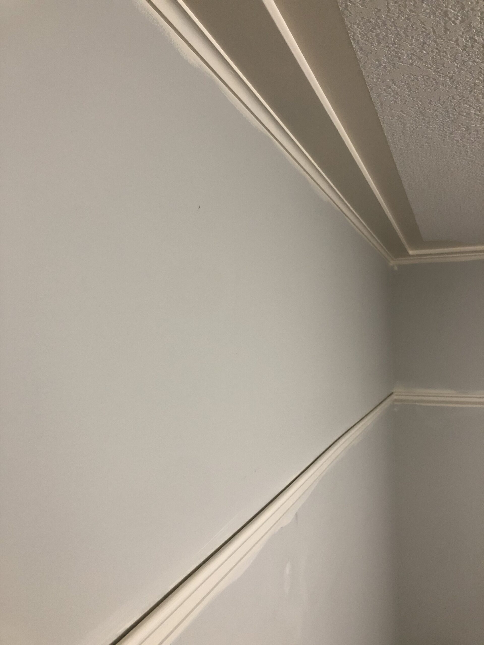
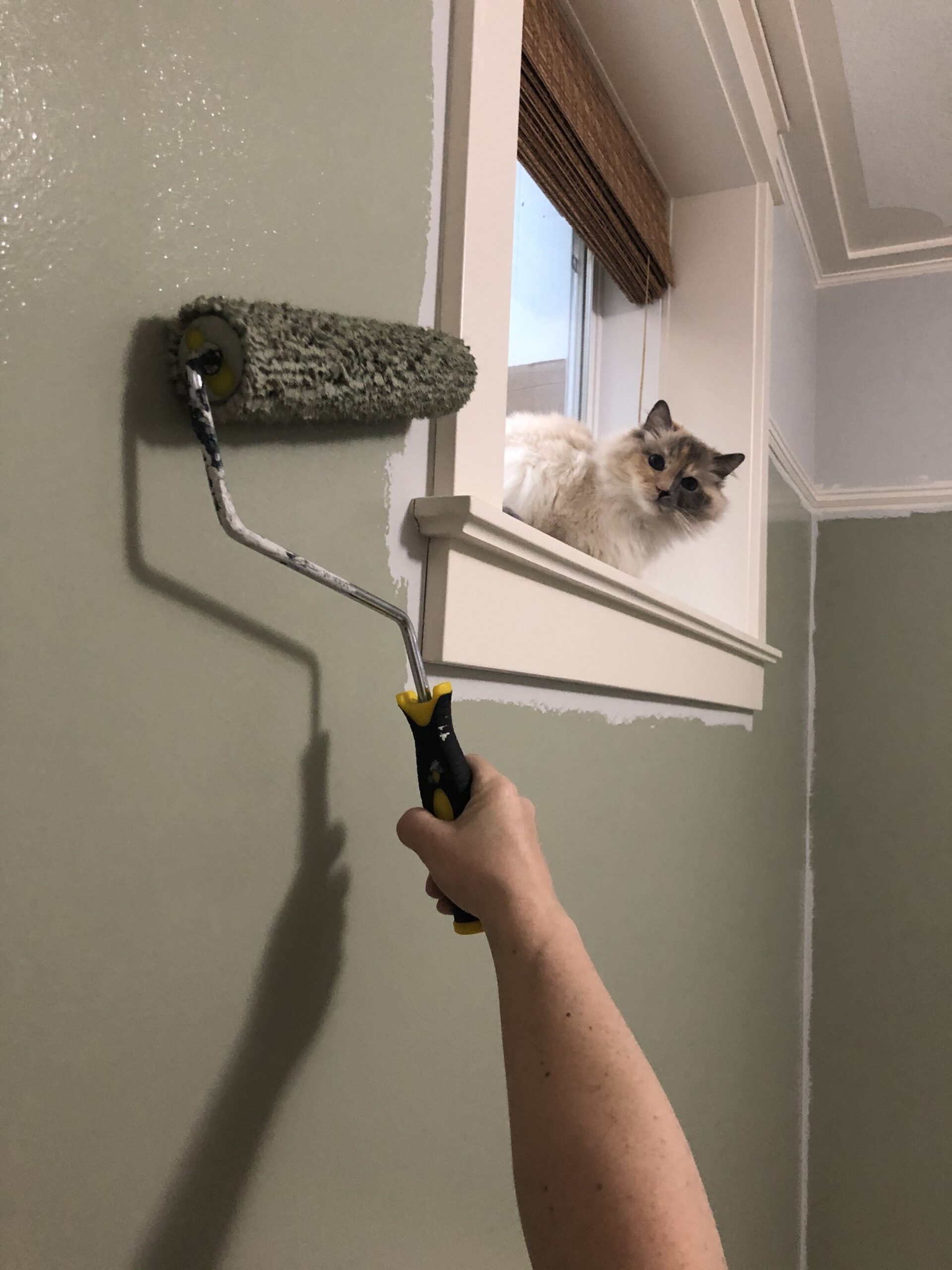
Now that I had determined I wanted picture rail trim, and wallpaper above that, I had this really annoying ceiling detail to contend with. You see, when I was young and stupid and building this house, I let my drywaller who was texturing my ceilings talk me into leaving the outer 8 or so inches of the ceiling flat and making it a bit of a detail. He also talked me into doing a radius on the corners. All the cool kids were doing it, he said. You can see that detail here:
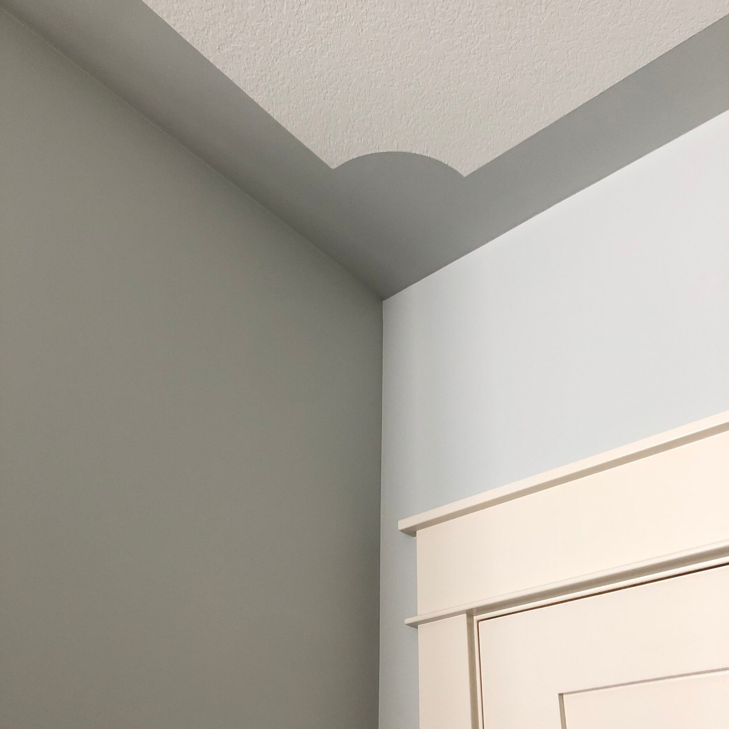
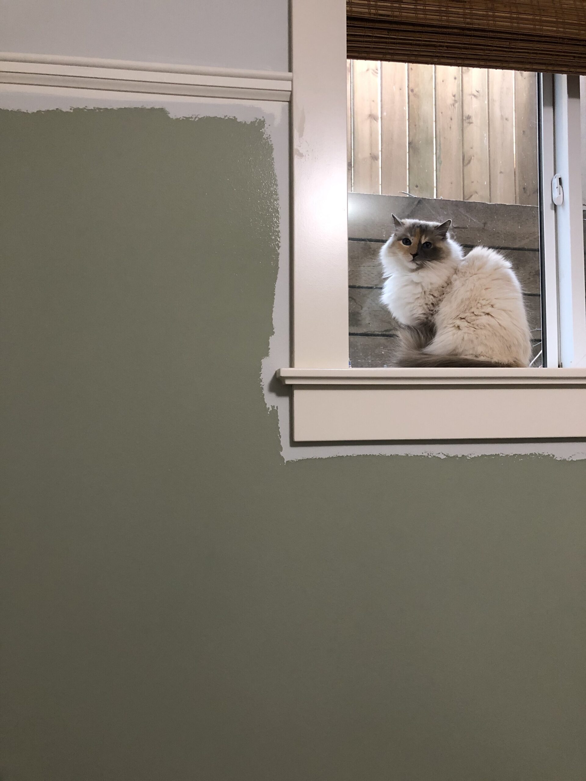
At any rate, much older and wiser me is now regretting that decision because every time I want to paint, I have to paint that bit of ceiling. My neck will never be the same. In this case, since I was going to have wallpaper to the top of the wall, how was I going to deal with that bit of ceiling? I could not paint this the wall color, as it would be a weird strip of color along the top of the wallpaper. I could (and did consider) paint it white to match the ceiling, but I have done this before and it still looks a little weird because it will never completely match the ceiling and go away, like I want it to. What I decided to do is to make it a feature – add some trim up there and paint the trim and that part of the ceiling that is not textured the color of my existing trim, in the hopes that it would it look like one built up section of crown, that was going to frame out the top and bottom of my wallpaper.
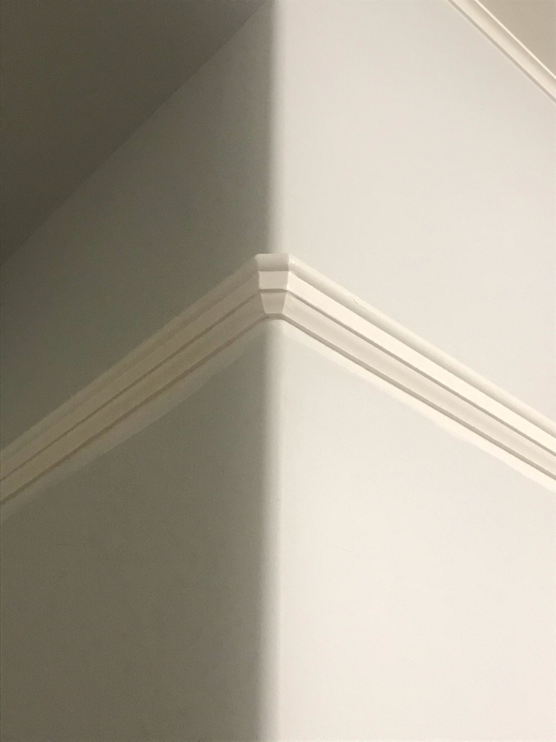
I had to stick to something that was a very low profile. As you can see in the photos below, my window trim goes almost all the way to the ceiling leaving less than an inch of space above it. I did not want to mess with the existing window trim (remember I said that carpenter was EXPENSIVE and I wanted to preserve his gorgeous work!) so I came up with a way to fit in a bit of flat moulding over the trim with another little piece of cove moulding. This ties in to the craftsman style look of the rest of my trim very well.
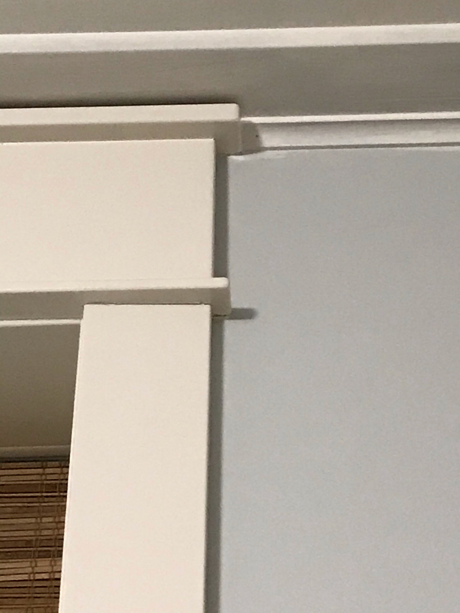
These were pretty easy to install because they were flat and so the normal issues people have with crown moulding installation did not happen. Woot! The picture rail went on relatively smoothly too, which was a relief since I did not have another six weeks to wait for more trim. I even successfully went around a rounded outside corner (with the help of a few online tutorials from actual carpenters) and was feeling pretty pleased with myself and even gloated a little on Instagram. Sorry. (Not sorry.)
Paint
Who knew I had so much to say about trim? But once the trim was up it was time to paint!
I had one minor mishap when I decided to pre-paint all the trim before putting it up using what I thought was leftover paint from my house, but was in fact leftover paint from my mom’s house. So that’s a whole evening I will never get back. I did eventually get it painted in the right color, in semi-gloss which is notoriously hard to work with and I can’t say it’s as good as my professional painter did, but then again he sprayed all my trim in place so I have to cut myself a little slack there.
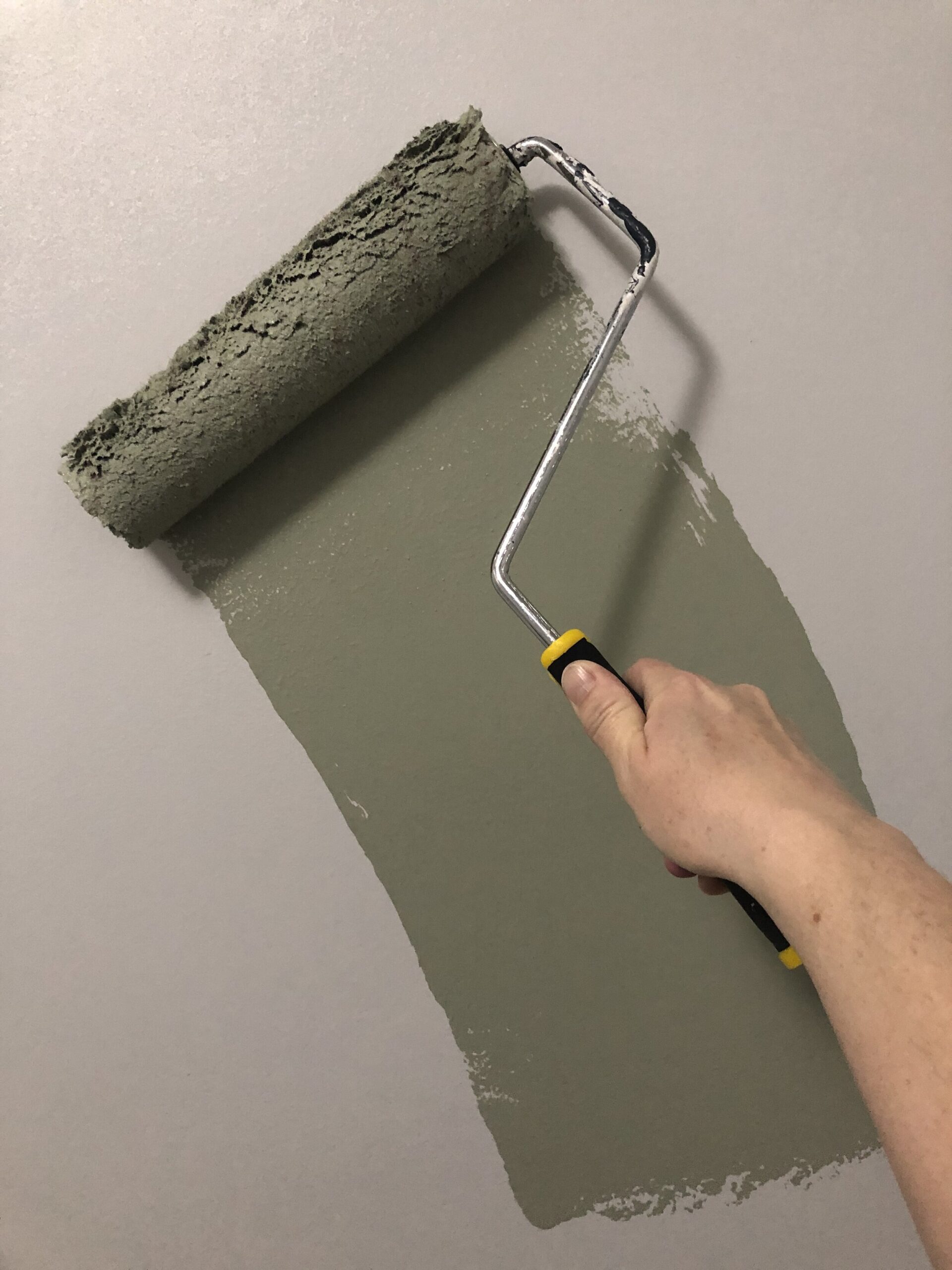
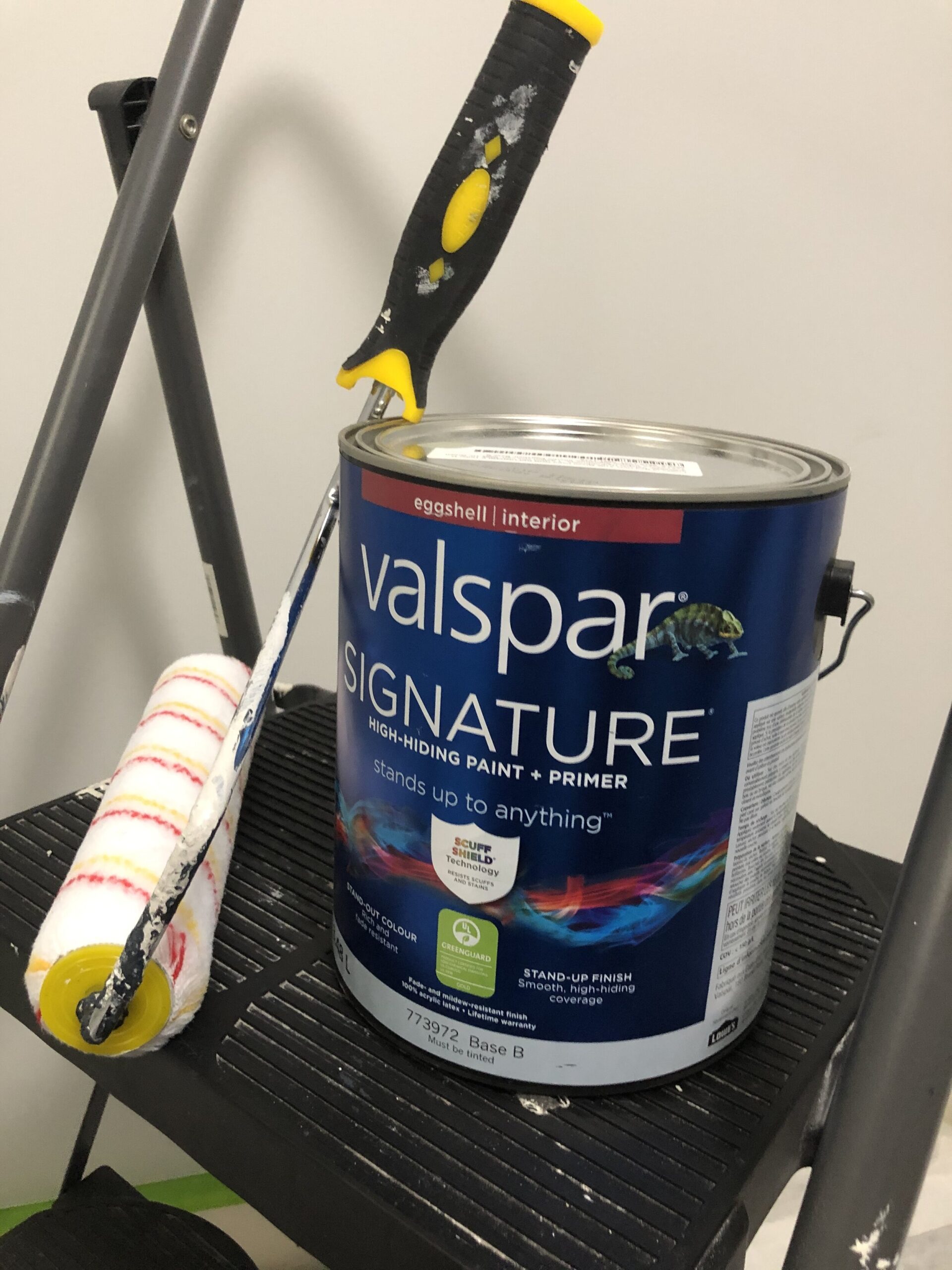
The paint colour for the walls was one of the first things I chose after the wallpaper. My wallpaper has a lot of colors in in but overall reads quite red/ pink, and I learned in design school (I did learn a few things there!) about the colour wheel and how complementary colours are, well, complementary! So green seemed like a natural choice, being the complementary colour for red. I really wanted to use Valspar Signature paint again, I have always been so impressed by the coverage and finish quality of that line so I reached out to Valspar to see if they would supply paint for this room, and they happily agreed! So now, onto the colour choice, the fun part!
I always try and test a few colours in the room and let me say these all looked very similar on the chips but very different in the room. Spend a little money and get some samples peeps! Worth it. From left to right, the colors I tested were Coastal Dusk, Green Tea Leaves, Seafoam Storm and Spring Spirits.
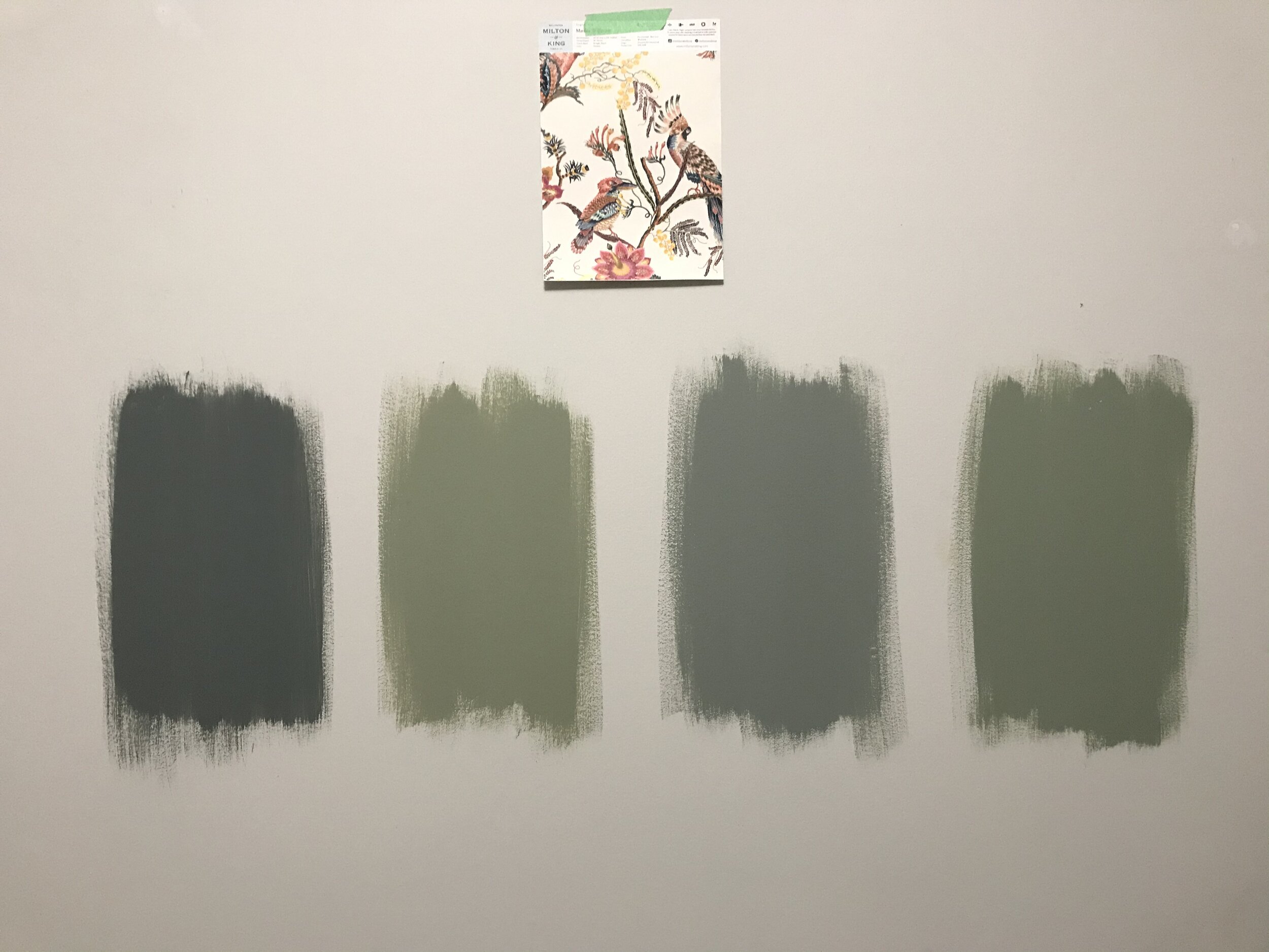
All of these colors are really gorgeous and I really could have chose any of them. For what I wanted though, Coastal Dusk was too dark and Seafoam Storm was too blue. I knew the wallpaper was a strong bold choice and so I wanted to choose a color that would tone that down a little and I didn’t want another super dark paint color, so I was leaning towards something a little lighter and maybe a tad muted. Valspar Green Tea Leaves was the winner and I was so excited to see how it looked with the wallpaper. Just what I was going for!
I just want to give a quick shout out to Valspar. I reached out to them asking if they would supply some paint for this project and they generously agreed. I asked Valspar, quite simply, because they are my favourite paint! I have used the Signature line a few times before and always had the same glorious results… virtually one coat coverage. I know a lot of paint brands claim to be one coat but Valspar Signature is the only one that I have used that comes close. I will probably paint a second coat because I’m extra like that but I really don’t need to. Also, Valspar is readily available at Lowes and often goes on sale, so that paint project can end up being much cheaper than you think.
I just wanted to give a HUGE thank you to the generous brands I have partnered with who provided sponsored items for this makeover. I’m so grateful that they saw enough potential in me and my little blog. I hope to do their fabulous products justice in the coming days!!
Milton and King (Wallpaper)
Spoonflower (Bedding)
Revival Rugs (Vintage Rug)
Valspar (Paint)
That’s all for today – be sure to check back next week (or subscribe!) where I will have some more progress to show you . If you want to catch some sneak peeks follow me on Instagram (@erinzubotdesign), I’ll be sharing a lot of behind the scenes there. Also, check out the other designers HERE or click the ORC Logo below, there is a great lineup of both featured and guest participants and there is a lot to catch up on. See you next week!

That wallpaper is STUNNING!!!
Erin, this is shaping up to be AMAZING. I can’t wait to see next week’s installment!
Thank you so much Heather!! I’m in love with it too!
Aww thanks Brianna! That means a lot!!
Erin!! That wallpaper is so lovely ✨
The wallpaper is so gorgeous!
Love the wallpaper and paint color selections!
This wallpaper is amazing! Can’t wait to see the rest of the space!
Love that wallpaper!
Thanks Ashley!
Thanks Julie! I’m excited to get that paper up!
Thanks April!
the wallpaper is divine!
Thanks Holly! I am excited for it!
I love that ceiling detail! I always do flat crown in my house and this is such a fun twist on that and will go really great with this design
Way t persevere on the picture railing, it looks wonderful! Love your wallpaper/paint combo as well. Looking good!
That wallpaper is dreamy!
Thank you so much Lindsey! I do like that added bit of cove, it gives it a little something extra!
Thank you so much Jennifer! I am like a dog with a bone when I get an idea, it’s hard for me to let it go!
Thank you so much Kyla! Milton and King has so many cool papers!